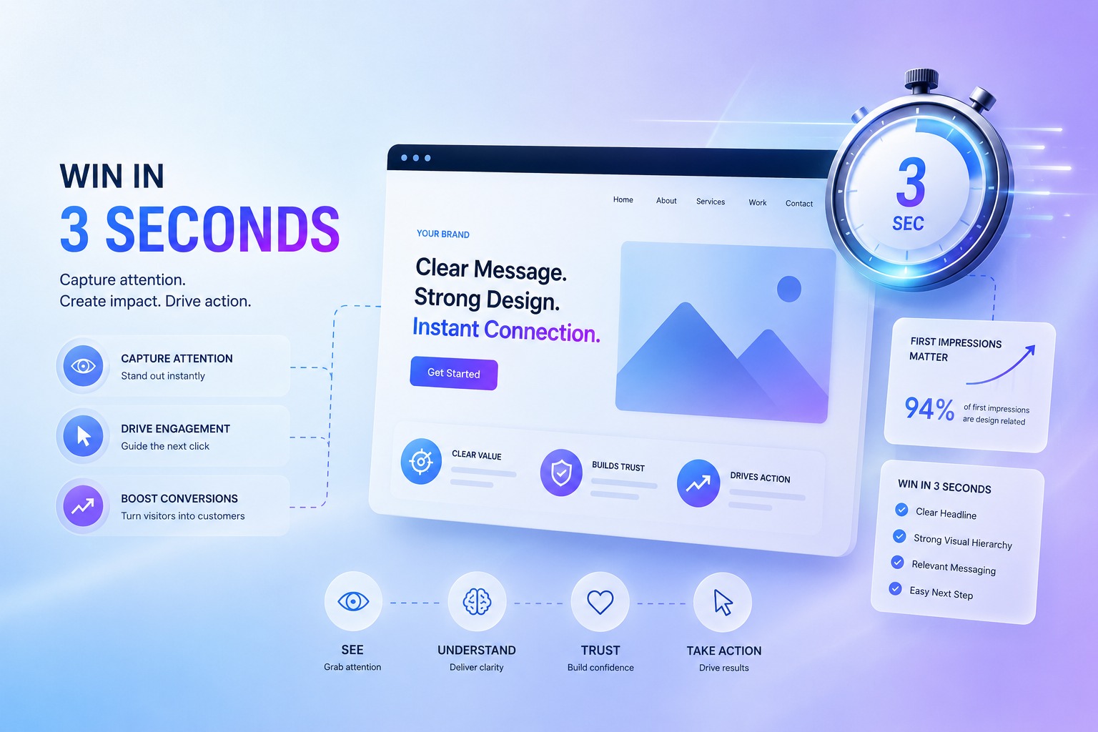
A visitor lands on your website. Within roughly three seconds, they have already decided whether to stay or leave, often before reading a single complete sentence. That decision is made almost entirely on feel: does this look fast, does it look trustworthy, and does it look relevant to what I came here for? It is an instinctive, near-instant judgement, and it happens long before logic gets involved.
Most websites lose people in exactly those three seconds. Not because the product is wrong or the pricing is off, but because the site is slow, confusing, or simply fails to make it obvious what to do next. Web development today is far less about how a site looks frozen in a portfolio screenshot and far more about how it performs in those critical opening moments on a real visitor's phone.
The Three-Second Verdict
People do not read websites the way they read books. They scan, they judge, and they bounce. In those first seconds, three things are being assessed almost instantly: how quickly the page loads, whether it looks credible and professional, and whether they can immediately tell what you do and where to click. Fail any one of those three and the visit is effectively over before it began.
The visitor rarely gives you a second chance to make the case, because there is always another tab and another option one tap away.
Speed Is a Feature, Not a Nicety
Site speed is the single most underrated factor in conversions. Every additional second of load time measurably increases the chance a visitor leaves before they ever see your offer. On mobile, where connection quality varies wildly and patience is famously thin, this effect is even more severe. A beautiful site that takes six seconds to appear is, for most practical purposes, an invisible site.
Speed is also a direct SEO factor. Google uses page experience signals in its rankings, which means a slow site is penalised twice: once by your impatient visitors and once by the search engine deciding who deserves to be found. Good development means lean code, properly optimised images, and a site that feels genuinely instant, not just one that happens to look impressive on a designer's high-end monitor with a fast office connection.
Design That Guides, Not Just Decorates
There is a real difference between a website that is merely pretty and one that actually works. Good design is, in a sense, invisible. It quietly guides the visitor toward the action you want them to take without them consciously noticing they are being guided at all. Cluttered layouts, unclear navigation, and three competing calls to action on one screen do the exact opposite, leaving visitors unsure where to look and quietly nudging them toward the back button.
This is the real value a UI/UX web design agency brings to the table: not decoration, but direction. The right agency studies how real users actually behave — where their eyes go first, what they tap, where they hesitate and abandon — and then designs the entire experience around that observed behaviour rather than around whatever aesthetic happens to be fashionable this year. Good UX is research wearing the disguise of good taste.
The Landing Page Is Where Money Is Made
Your homepage introduces your brand to the world. Your landing pages are where deals actually close. A landing page exists to do one job and one job only: to convert a specific visitor, arriving from a specific source, toward a specific action. Sending expensive paid traffic to a general-purpose homepage is one of the most common and quietly costly mistakes in all of digital marketing, because the homepage was built to serve everyone and therefore persuades no one in particular.
A focused landing page strips away every distraction, speaks directly to one audience, and makes the next step completely unmistakable. This is exactly where professional landing page optimization services India businesses invest in earn their keep: small, deliberate improvements to headlines, layout, form length, social proof, and load speed can lift conversion rates dramatically. The same advertising budget suddenly produces far more leads, simply because the page receiving the traffic is finally doing its job properly.
Mobile-First Isn't Optional Anymore
The clear majority of web traffic in India is mobile, and for many sectors it is the overwhelming majority by a wide margin. Yet a surprising number of sites are still designed on a desktop first and then merely "squished" down to fit a phone screen as an afterthought. That compromise always shows, in cramped text, tiny buttons, and forms that are genuinely painful to complete with a thumb on the move.
A true mobile-first approach designs for the small screen first and then scales up, ensuring buttons are easily tappable, text is comfortably readable without zooming, and forms can be completed in a few taps. Win the first three seconds on the device your customers actually hold in their hands, and you have earned the right to make your case. Lose those seconds, and the rest of your carefully planned marketing budget is quietly funding a website that turns people away faster than you can attract them.